Project Overview
Starry Night Digital is a 3D animation and digital studio focused on animation, architectural visualization and creative digital services.
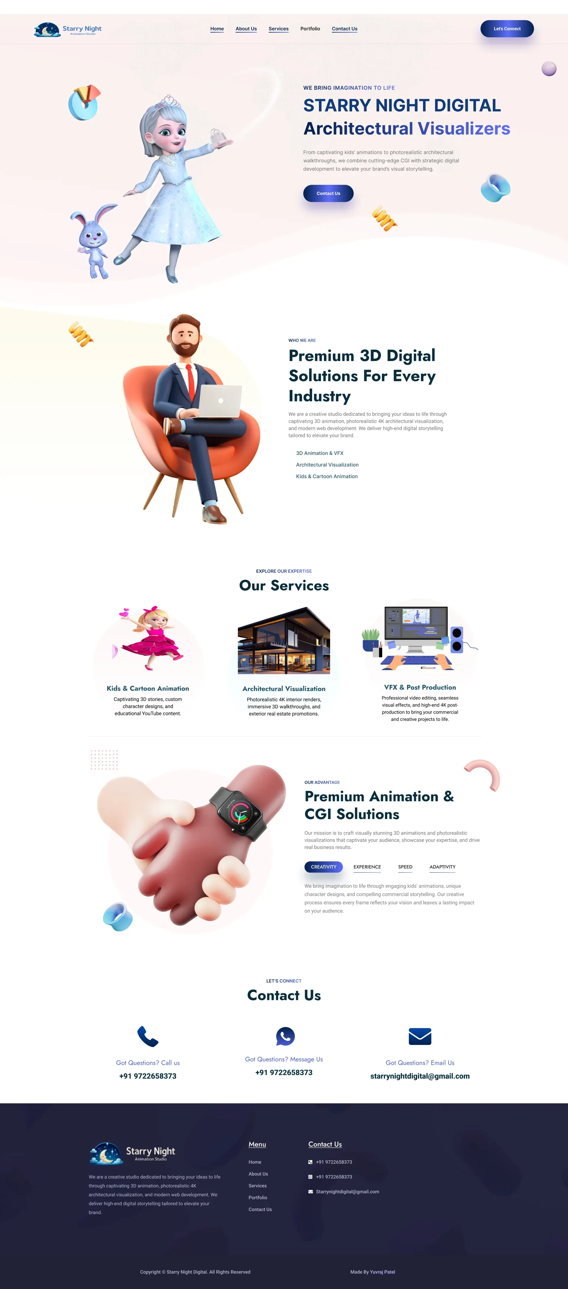
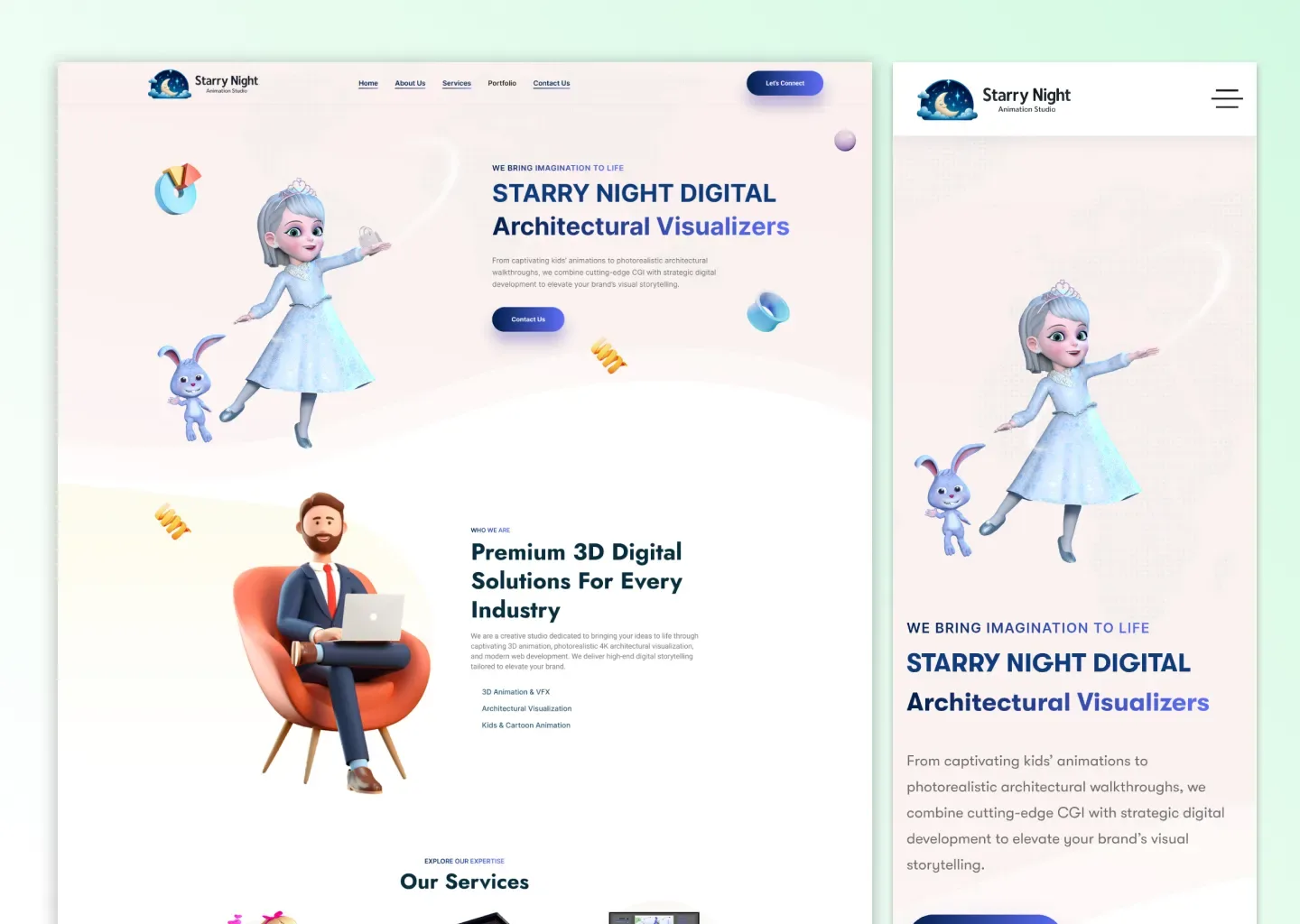
For this project, I designed a responsive website experience that presents the studio's work in a visually strong and portfolio driven format.
The UI/UX direction focused on making creative work the main element of the website while keeping the studio's services, capabilities and project information easy to understand across desktop and mobile devices.
Project Goal
The main goal was to create a digital experience that feels cinematic, modern and creative while clearly communicating what Starry Night Digital does.
The website needed to help visitors:
- Understand the studio's creative capabilities
- Explore animation and visualization work
- Discover available creative services
- Build trust through visual project presentation
- Understand the studio's overall creative direction
- Contact the team for potential projects and collaborations
My Role
I worked on the complete UI/UX design and website experience for Starry Night Digital.
My responsibilities included:
- UI design
- UX planning
- Website structure
- Desktop interface design
- Mobile responsive design
- Visual hierarchy
- Portfolio presentation
- Creative service presentation
- Project showcase layouts
- Content organisation
- Calls to action
- Responsive behaviour
- Figma project organisation
- Design consistency across the experience
The Challenge
A creative studio website needs to communicate quality almost immediately.
Visitors often judge an animation or visualization studio based on the presentation of its work, so the interface could not feel like a traditional corporate website.
The main challenge was creating an experience where visual projects remain the strongest part of the page while important information about the studio and its services is still easy to discover.
The design also needed to support different types of creative output, including:
- 3D animation
- Architectural visualization
- Digital creative work
- Visual production
- Portfolio projects
The experience needed to bring all of these areas together within one consistent interface.
UX Strategy
The website experience was structured around visual discovery.
Studio Introduction
The opening experience immediately establishes Starry Night Digital as a creative and visual studio.
Strong project imagery and focused messaging help communicate the studio's identity quickly.
Creative Work Discovery
Visitors can explore visual work without being distracted by unnecessary interface elements.
The portfolio presentation gives creative projects enough space to stand out.
Service Discovery
The website explains the studio's capabilities through clear service focused sections.
This helps potential clients understand the type of work Starry Night Digital can deliver.
Trust Building
High quality project presentation helps establish credibility and demonstrates the studio's creative capability.
Contact and Collaboration
Once visitors understand the studio and explore its work, the experience guides them towards contacting the team for potential projects or collaborations.
Information Architecture
The project is organised primarily as a single page experience designed for both desktop and mobile devices.
The page brings together multiple parts of the studio experience within one continuous flow.
Introduction
The opening section establishes the studio's visual identity and creative direction.
Portfolio Showcase
Creative projects are presented as a major part of the experience so visitors can immediately see the quality and style of the studio's work.
Services
Service sections communicate the studio's creative capabilities and areas of expertise.
Studio Information
Supporting content provides additional context about Starry Night Digital and its approach.
Contact
The final part of the experience encourages visitors to start a conversation about their project requirements.
Portfolio Experience
The portfolio is one of the most important parts of the website.
The interface was designed to keep project visuals at the centre of the experience.
Large visual areas help communicate the quality of:
- Animation work
- Architectural visualization
- Creative production
- Digital projects
- Studio capabilities
The layout avoids unnecessary visual competition so the work itself remains the main focus.
Service Presentation
The studio's services are presented in a clear and visually consistent way.
Each service area is structured so visitors can quickly understand the type of creative work the studio provides.
The service presentation focuses on:
- Clear hierarchy
- Strong supporting visuals
- Concise information
- Consistent spacing
- Easy scanning
- Clear calls to action
Visual Design Direction
The visual direction was designed to support the studio's creative and cinematic identity.
The interface focuses on:
- Large project visuals
- Strong typography
- Dark and immersive presentation
- Clear content hierarchy
- Spacious layouts
- Modern composition
- Minimal interface distractions
- Portfolio focused sections
- Strong calls to action
- Responsive behaviour
Responsive Design
The experience was designed for both desktop and mobile devices.
The responsive layout ensures that creative work remains visually impactful while the content stays comfortable to browse on smaller screens.
Important considerations included:
- Image scaling
- Portfolio presentation
- Typography
- Section spacing
- Content order
- Navigation
- Service presentation
- Calls to action
Desktop Experience
The desktop layout provides more room for large project visuals and immersive compositions.
This helps communicate the cinematic and creative nature of the studio while keeping information structured and readable.
Mobile Experience
The mobile experience reorganises the content into a more focused vertical flow.
The design prioritises:
- Visual clarity
- Comfortable spacing
- Readable typography
- Strong project imagery
- Simplified navigation
- Accessible calls to action
Reusable Design Patterns
Reusable patterns were used to maintain consistency throughout the website.
These include:
- Typography hierarchy
- Project presentation
- Service sections
- Buttons
- Calls to action
- Content spacing
- Image layouts
- Responsive spacing
- Section structures
Figma Workflow
The Starry Night Digital project is documented inside my Live Client Projects Figma file.
The Figma presentation includes the project preview, project description, screen coverage and live website reference.
Design to Development
The UI/UX direction was translated into the live Starry Night Digital website.
This allowed the design to be evaluated using real creative work, real content and responsive behaviour.
The live implementation demonstrates how the visual design works in a real studio environment across:
- Desktop devices
- Mobile devices
- Creative portfolio content
- Service information
- Real project visuals
- Visitor interactions
Final Result
The final result is a responsive studio website that gives Starry Night Digital a strong digital presence while keeping its creative work at the centre of the experience.
Visitors can:
- Understand the studio's identity
- Explore animation and visualization work
- Discover creative services
- Evaluate the studio's capabilities
- Build trust through project presentation
- Contact the studio for collaborations and projects
Project Highlights
- Complete website UI/UX design
- Real creative studio client project
- Single page responsive experience
- Desktop and mobile layouts
- Portfolio focused interface
- 3D animation presentation
- Architectural visualization showcase
- Creative service presentation
- Strong visual hierarchy
- Responsive content structure
- Figma based workflow
- Live production website
Project Information
Client: Starry Night Digital
Role: UI/UX Designer
Industry: 3D Animation & Digital Studio
Project Type: Client Website
Platforms: Desktop Web and Mobile Web
Primary Design Tool: Figma
Status: Live
Live Website: starrynightdigital.com
Figma Project: View UI/UX Project